Jem
Viscount
 ?
?
Posts: 3,418 
|
Post by Jem on Feb 5, 2014 14:17:04 GMT
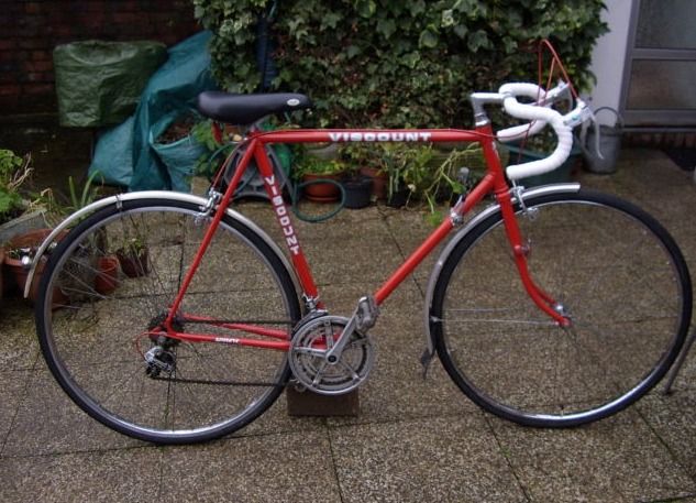
It shouldn't really carry much weight when picking a bike but I find I put perhaps quite a lot of emphasis on the 'look' of a bike. By this I mean the general overall geometry and shape, whether it has classic/period parts and vintage look (for me 70's & early 80's), and then down to the finer detail like the colour, the chroming and decals. Now for some reason,here below we have here a perfectly good Sprint in excellent condition on eBay but the decal font is just putting me off. I know it can be changed and the bike is still the same but it really doesn't do it for me. I am thinking that the 'look' factor 'weighting' in choosing a bike might be as high as 50% for me, and certain colours are going to be a clincher one way or the other. A curious and rather embarrassing admission bearing in mind that when you are riding it , you don't see much of the bike at all  |
|
|
|
Post by velocipete on Feb 5, 2014 18:56:45 GMT
I agree that the geometry of a bike is important. 72 degrees parallel, horizontal top tube,22.5",perfection!
The bike you posted,whilst being not a bad colour,reminds me of bikes often being sold on evilbay with
Shimano in block capitals everywhere on the frame.I'm sure that Viscount were more subtle than the
photo in your post,but who,other than Steve,really has a clue?
Cheers,
Pete.
|
|
|
|
Post by whippet on Feb 5, 2014 22:12:02 GMT
White tape and very low saddle doesn't help it either.
|
|
Jem
Viscount
 ?
?
Posts: 3,418 
|
Post by Jem on Feb 5, 2014 22:34:25 GMT
Looking at it again, does it even seem 'full size'?
|
|
|
|
Post by sprockit on Feb 9, 2014 23:05:04 GMT
This bike doesn't look right to me.
Positioning the decal on the top tube seems wrong, as does the font.
I'm sure there are folk on here who know much more than me, but my experience is that when the company emblazoned the main parts of the frame with the word Viscount in more than one location, the decals were on the seat tube and the down tube.
It also seems curious that the font is in solid capitals, whereas so many bikes have some sort of outline - my Sport is blue with Viscount in red characters which have a white outline, and my white Team '82 frame has Viscount in capitals which are just black outline characters.
I agree with both Sooper8 and Whippet that the bike doesn't look right.
|
|
Jem
Viscount
 ?
?
Posts: 3,418 
|
Post by Jem on Feb 10, 2014 7:07:40 GMT
I must be honest and say I think I have seen this font before on a Viscount (I'm Googling to find it now) - and although I don't like it, I get the feeling that it is original.
Although to have 'Viscount' twice and no model name just seems to be a mistake.
As I mentioned earlier, I think it might be a kids model? It looks kind of 'out'?
|
|
|
|
Post by Stella on Feb 12, 2014 20:50:54 GMT
It shouldn't really carry much weight when picking a bike but I find I put perhaps quite a lot of emphasis on the 'look' of a bike. By this I mean the general overall geometry and shape, whether it has classic/period parts and vintage look (for me 70's & early 80's), and then down to the finer detail like the colour, the chroming and decals. Now for some reason,here below we have here a perfectly good Sprint in excellent condition on eBay but the decal font is just putting me off. I know it can be changed and the bike is still the same but it really doesn't do it for me. I am thinking that the 'look' factor 'weighting' in choosing a bike might be as high as 50% for me, and certain colours are going to be a clincher one way or the other. A curious and rather embarrassing admission bearing in mind that when you are riding it , you don't see much of the bike at all  Don't like this either. It looks like some drunken man has accidentally swapped the down and top tube. The Viscount up there looks just wrong. |
|
|
|
Post by Stella on Feb 12, 2014 20:52:23 GMT
I must be honest and say I think I have seen this font before on a Viscount (I'm Googling to find it now) - and although I don't like it, I get the feeling that it is original. Although to have 'Viscount' twice and no model name just seems to be a mistake. As I mentioned earlier, I think it might be a kids model? It looks kind of 'out'? Seen the font a few times. If I remember correctly John's green bike has it. I like it, but it's in the wrong place. |
|
|
|
Post by velocipete on Feb 12, 2014 21:05:53 GMT
It shouldn't really carry much weight when picking a bike but I find I put perhaps quite a lot of emphasis on the 'look' of a bike. By this I mean the general overall geometry and shape, whether it has classic/period parts and vintage look (for me 70's & early 80's), and then down to the finer detail like the colour, the chroming and decals. Now for some reason,here below we have here a perfectly good Sprint in excellent condition on eBay but the decal font is just putting me off. I know it can be changed and the bike is still the same but it really doesn't do it for me. I am thinking that the 'look' factor 'weighting' in choosing a bike might be as high as 50% for me, and certain colours are going to be a clincher one way or the other. A curious and rather embarrassing admission bearing in mind that when you are riding it , you don't see much of the bike at all  Don't like this either. It looks like some drunken man has accidentally swapped the down and top tube. The Viscount up there looks just wrong. |
|
|
|
Post by velocipete on Feb 12, 2014 21:09:31 GMT
Stella,could we just substitute "person" for man?
Cheers,
Pete.
|
|
|
|
Post by Stella on Feb 12, 2014 21:52:03 GMT
Of course. My apologies.
|
|
|
|
Post by sprockit on Feb 12, 2014 22:23:40 GMT
Have just seen new and close-up pictures of what I assume to be this bike on eBay, and the font is an outline. I was wrong - nowt new there then - but the positioning of the brand name on the top tube still looks wrong to my eye, and there's no model name.
Perhaps as well as chucking any old parts on the bikes, they just placed the decals at whim!
Sprockit
|
|
|
|
Post by Stella on Feb 13, 2014 19:22:14 GMT
Have just seen new and close-up pictures of what I assume to be this bike on eBay, and the font is an outline. I was wrong - nowt new there then - but the positioning of the brand name on the top tube still looks wrong to my eye, and there's no model name. Perhaps as well as chucking any old parts on the bikes, they just placed the decals at whim! Sprockit As I said, all in an drunken effort, by the looks of it.  |
|